Superstore Sales Dashboard
This dashboard was created during my Data Analytics Bootcamp.
A "Purpose Driven" Project Manager, who pivoted from a career in law as a Commercial Litigation Paralegal and Paralegal Co-ordinator. I am a lover of people, an effective communicator and a problem solver! Skilled in Excel, SQL, Legal Project Management and Data Visualization tools (Power BI and Tableau). Follow my journey on Linkedin and view my projects on Git Hub.

This analysis was conducted as part of my final Bootcamp Project. A manager at a fictitious bank was disturbed with more and more customers leaving the credit card services. As the Data Analyst in this project, I analysed 10,000 + credit card customers, by demographic, to predict customers who were likely to churn.

In this project, I conducted an analysis of the sales of purchased bikes using Microsoft Excel. The insights from the analysis provided useful information on the type of customers purchasing the company's bikes. The Bike Company can use the insights to make data-informed decisions which could lead to increased sales and can also give them more focus on their target audience for marketing.

This dashboard was visualised using Microsoft Power BI during my Data Analytics Bootcamp. As part of my analysis, I highlighted the total sum of sales and the total quantity sold by the company. I also highlighted the sum of the loss made during that period (2014-2017). It was very useful being able to see how the sum of sales was reflected year by year, broken down by category/sub-category as well as the sales across the different states.

In this project, I explored COVID-19 global data from January 2020 to March 2023, exploring confirmed COVID-19 deaths. I also queried and analysed the total cases and total deaths caused by COVID-19 in the United Kingdom where I reside. Insights such as countries with the highest death count per population and total deaths per continent infected were analysed and then visualised with Tableau.

This project analyses the variables that effect the gross revenue from movies. Following my analysis, I visualised the correlation between the variables using Matplotlib and Seaborn (Budget vs Gross Earnings). I also created a correlation matrix for numerical features.

In this project, I scraped data from Amazon to analyse price data for a product.

This analysis stemmed from a survey of 630 Data Professionals conducted by Alex Freberg (Alex the Analyst). The analysis revealed the favourite programming languages of data professionals, the average salary by job title and difficulty breaking into data. It was interesting to see the responses of data professionals on their happiness with their salary and their happiness with work life balance.
This project focused on analysing data sets and advising a client on customer targeting with the Data, Analytics and Modelling team. This internship provided me with the opportunity to step into the shoes of a KPMG team member and complete tasks that replicate the work that the Data Analytics team do every day. Key skills learned included Data Analysis, Customer Segmentation, Data Dashboards and more...

Data Visualisation allows me as a Data Analyst to analyse complex data, identify patterns and extract valuable insights. Simplifying complex information and presenting it visually enables decision-makers to make informed and effective decisions quickly and accurately. See below the dashboards I have created using Tableau.
This dashboard was created during my Data Analytics Bootcamp.
.jpg)
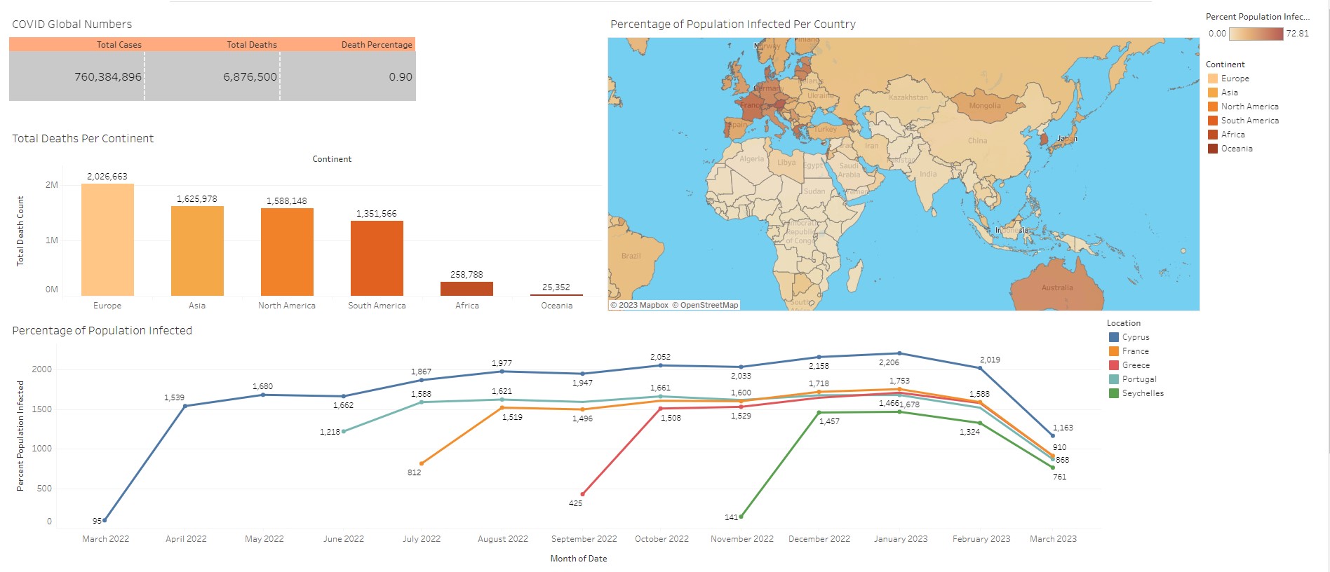
Visualised insights such as countries with the highest death count per population and total deaths per continent infected.